
JONAH BURLINGAME
 |  |  |
|---|---|---|
 |  |  |
 |  |  |
 |  |  |
 |  |  |
 |  |  |
 |  |  |
 | 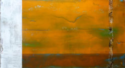 |
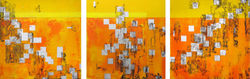
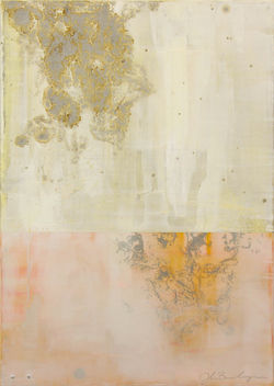
T E X T U R A L A B S T R A C T s in M I X E D M E D I U M S
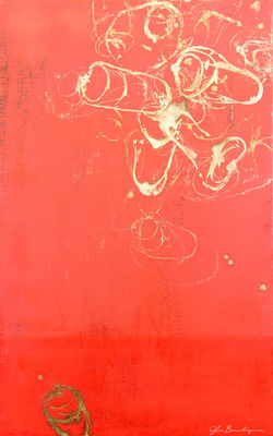
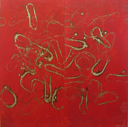
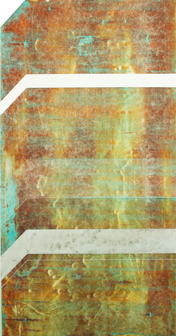
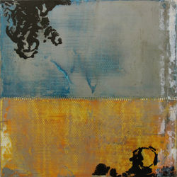
"My work is a self discovered style. It results from a process of applying paint, varnish and aluminum roofing cement in very thin layers using non traditional implements such as window squeegees, 14" drywall blades, windshield wipers, string, rubber bands and others. I've intentionally limited the materials and their application in order to force my focus on the process and its evolution. Within this process I have left plenty of opportunity for chance - I refer to it as ‘controlling the accident’. It’s these ‘accidents’ that often become the subject of future bodies of work. In allowing for chance within my process, I’m constantly challenging myself with new problems, and thus repeatedly questioning my creative direction.
An important but less visible part of the artistic process, then, is evolving creatively. Through my recent journey to find inspiration, materials such as fiberglass cloth and aluminum, together with themes of transformation, action, and distress have provided new opportunities for creativity. The subject of my work continues to be the work itself, but these new methods of working were inspired by a recurring presence of “A Clockwork Orange” in my life. When I was about 10 years old I visited my mother and she gave me the soundtrack to “A Clockwork Orange.” I explored the album and was intrigued by it. At about 16, I saw the film for the first time. Recently, I revisited the album, book, and film of “A Clockwork Orange.” Colors such as blue, grey, black, white and orange seemed very intentional. White molded plastic, aluminum, fiberglass, and deep glossy finishes also came to mind, which later led to the use of such things in my work. The inspiration I found is reduced to basic elements such as color, composition and texture. Rich color fields and organic textures are juxtaposed with graphic lines that seek to show a balance of man and nature, energy and tranquility. The subject of my work is the work itself. I consider it pure abstraction. The titles come from my time outside the studio while simply engaged with my surroundings. These word pairings are merely intended to add yet another layer of abstraction, rather than provide clues of any intended meaning. Ultimately I offer the work for the viewer’s own interpretation."
Contact us with Inquiries
art | cult-ure | full-on reality